
It takes a lot of courage to launch a new venture in a time of so much uncertainty, but with big change there's big opportunity. With everyone quarantined during Covid, Anckor saw the potential for a new kind of home workout that addressed more than just the physical benefits of a 'workout'. Founder Brian Von Ancken has set out to create a 'Total Health' workout that also addresses the body, mind, spirit, and social health.
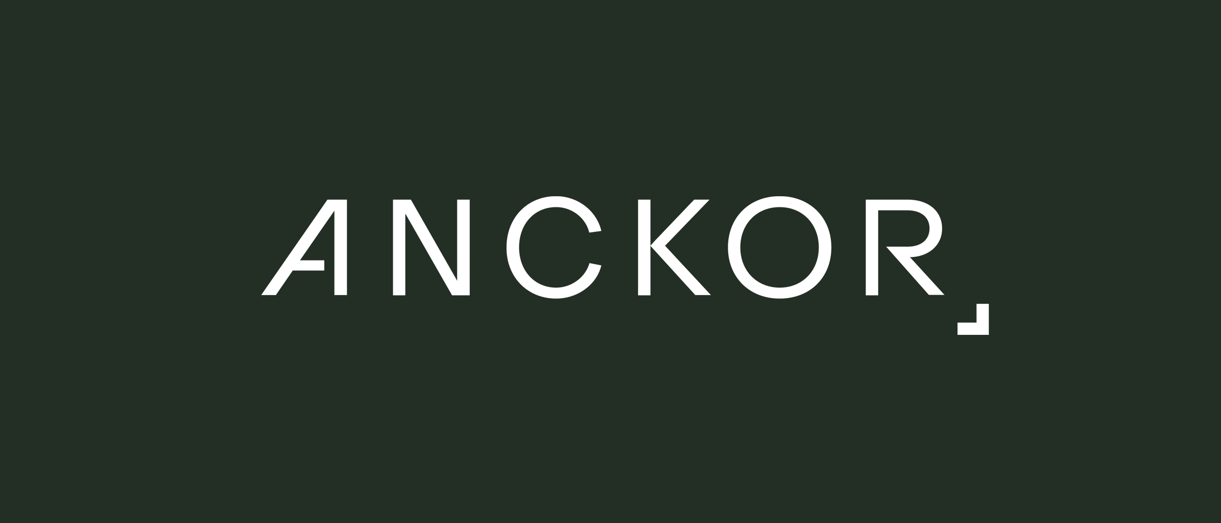
For the logo mark we chose a type-based logo because the name Anchor is short and sweet. Type logos can often lack personality or fail to be memorable, but when done right, they can be magical.
We worked a lot with the symmetry of the word ANCKOR. We chose to straighten the right side of the A to mirror the R. The diagonal lines left in the A and R lean in opposite directions giving the word a wide foundational base.

We wanted to represent the idea of an anchor without drawing a popeye-style anckor as the logo, so we created a minimal 'graphic anchor' that is used in the branding system to ground the wordmark and give it a strong sense of gravity.

We also wanted to create a visual system that could be carried over into different aspects of the visual identity, so the 'anckor' symbol is also used on photos, and quotes to reinforce the branding.

Their ability to create a beautiful brand and a user-friendly site is what stands out to us the most. They didn’t have to compromise our site’s beauty to make it look professional.
Brian Von Ancken – Founder Anckor


