
Our first meeting with Steven and Kat took place in the foundation’s warehouse. That’s one of the best parts of working with art foundations. You get to stand in front of work most people never see.
They pulled out paintings, works on paper and sketches by Alice Trumbull Mason and her daughter Emily Mason, two important figures from different generations of American abstraction.
Alice was making non-objective paintings by 1929. At the 1935 Washington Square Art Show, she was the only artist out of more than 400 exhibiting abstract work. A year later, she helped found American Abstract Artists, an organization created to promote abstraction at a time when it was still struggling for acceptance in the United States. She remained involved for decades and eventually served as its president.
Emily’s art education began in her mother’s studio, but she went on to build a long career of her own. She studied at Cooper Union, received a Fulbright to paint in Venice, and studied at the Accademia di Belle Arti there. She began exhibiting in New York in 1960 and continued painting and showing her work for more than fifty years, while also teaching at Hunter College for over three decades.
In 2018, Emily created a foundation to preserve Alice’s legacy and create opportunities for underrepresented artists. After Emily died the following year, the foundation expanded its mission to include her work as well.
The mission was unified, but their identity was not. Emily had a website, Alice had a website, and the foundation had a third, so a visitor could spend an afternoon with one artist and never learn the other existed. The full name didn't help either. At eight words, "The Emily Mason and Alice Trumbull Mason Foundation" was accurate but unusable in conversation, on a business card, or in a URL.
The challenge was to create one identity for both artists, then take two separate websites and turn them into one cohesive site for the foundation.
Finding one name for two artists
The name was the first design decision. Institutional art brands have long understood the value of compression (MoMA, LACMA), so before drawing anything, we condensed the name. EMATM takes the initials of both artists in equal measure. Five letters. Easy to say, and finally short enough for a clean URL at ematm.org. It took some lobbying, but the foundation saw the value and embraced it quickly.
The monogram follows the same logic. Both artists share the M of Mason, so we built the mark from two Ms, mirrored and interlocked. If you look at it one way it's a shared initial, if you want to read deeper into the meaning, it's also a daughter's reflecting and answering her mother's art and legacy.
We chose a limited but vibrant color palette. One typeface family. Plenty of space. Our goal with art foundations is always the same: a timeless brand that's memorable without distracting from what should be the main focus, the artists' work.

One site for both artists
Alice and Emily also had separate websites, each built around her own work and history. We rebuilt them as one site for the foundation.
The homepage gives both artists equal presence, with a portrait, dates and a clear entry point into each body of work. From there, each artist retains her own biography, chronology and artwork.
We treated the biographies and chronologies more like editorial features than database pages. There’s a lot of history here, and we wanted it to be something people would actually spend time reading and exploring.
The audience ranges from researchers who already know the work to people encountering Alice or Emily for the first time. Image quality was important for all of them.
Artwork is served at very high resolution using modern image formats, with zoom deep enough to pick up pencil lines, brushstrokes and details that usually disappear on a screen.
The first time we saw the work was in that warehouse, pulling pieces out one after another and leaning in to see them up close. The website gets surprisingly close to that experience.
The brand at work
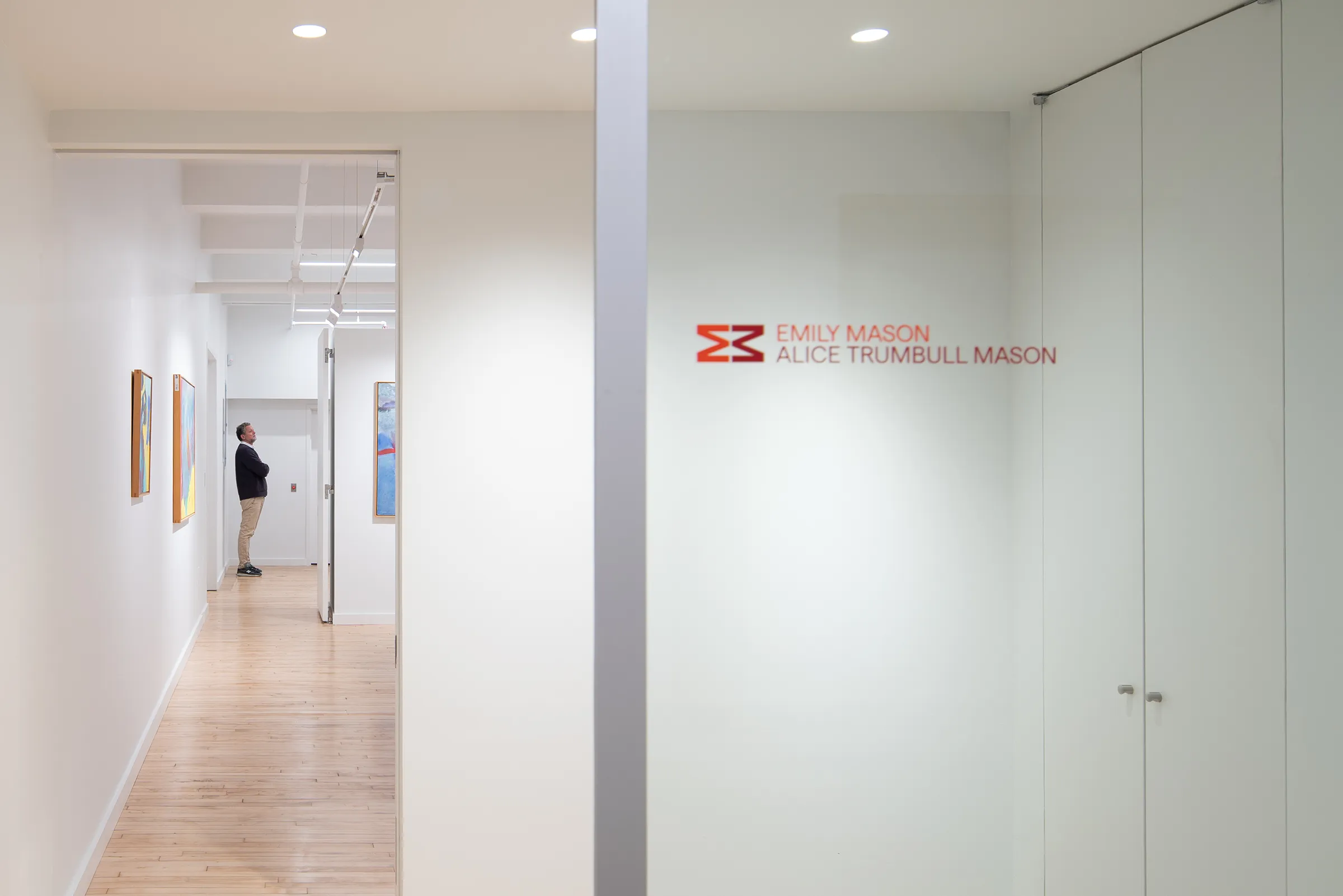
The mirrored M now appears throughout the foundation’s materials and physical space, including the glass at the entrance to its office.
Alice and Emily remain very much themselves, while the foundation now has a clear identity of its own and one place where both bodies of work can live together.
We continue to work with the foundation as that identity grows.
Condensed was incredible at receiving changes and finding answers... They delivered most everything to meet our ideal deadlines. As with all projects, there are new challenges as you delve into the project and the scope and scale of the project sometimes evolves. The team was incredibly receptive to our feedback and flexible to these needs.
I also never worked with a company that offered unlimited revisions (re: logo). This took the pressure off and in a way that was quite brilliant, allowed us to come to an efficient solution probably quicker than those companies that insist on a limited number of rounds.
— Steven Rose, Executive Director, EMATM

