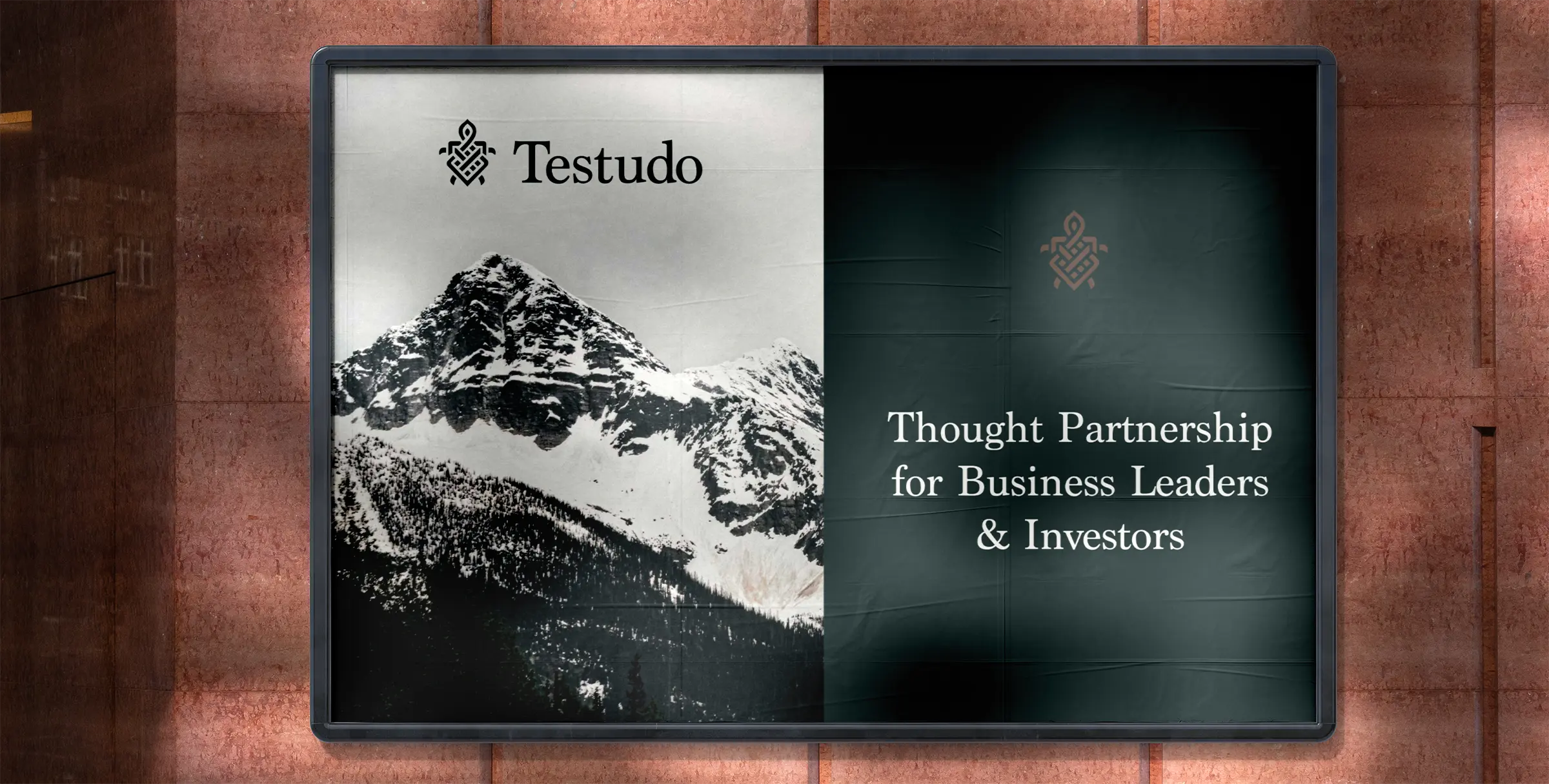
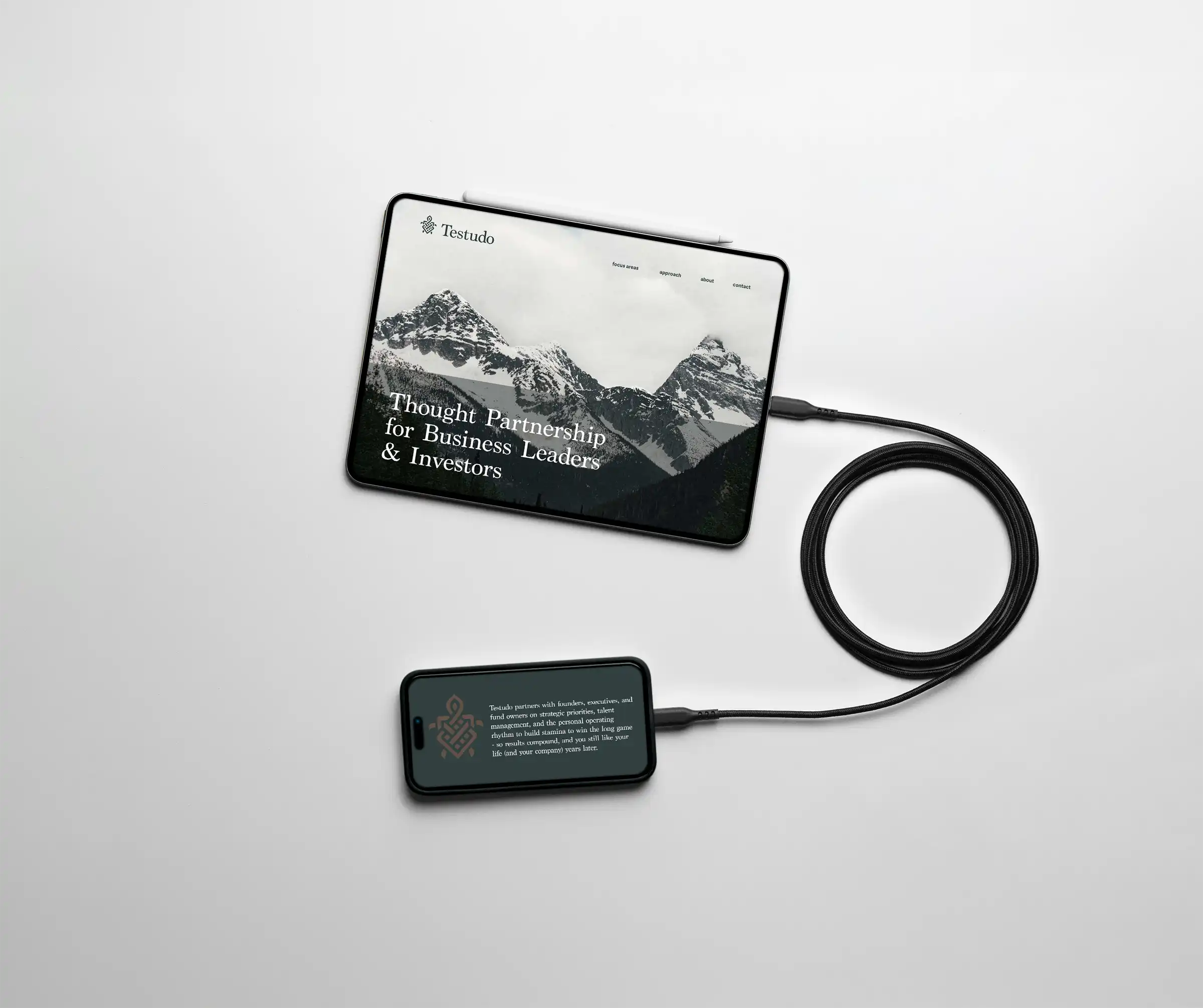
Thought Partnership for Business Leaders
Testudo Advisory partners with executives and investors to build thriving businesses while maintaining balanced happy lives. Part business coach, and part therapist, Testudo’s team re-programs leaders to have the well-being and stamina to win at the long game of business.
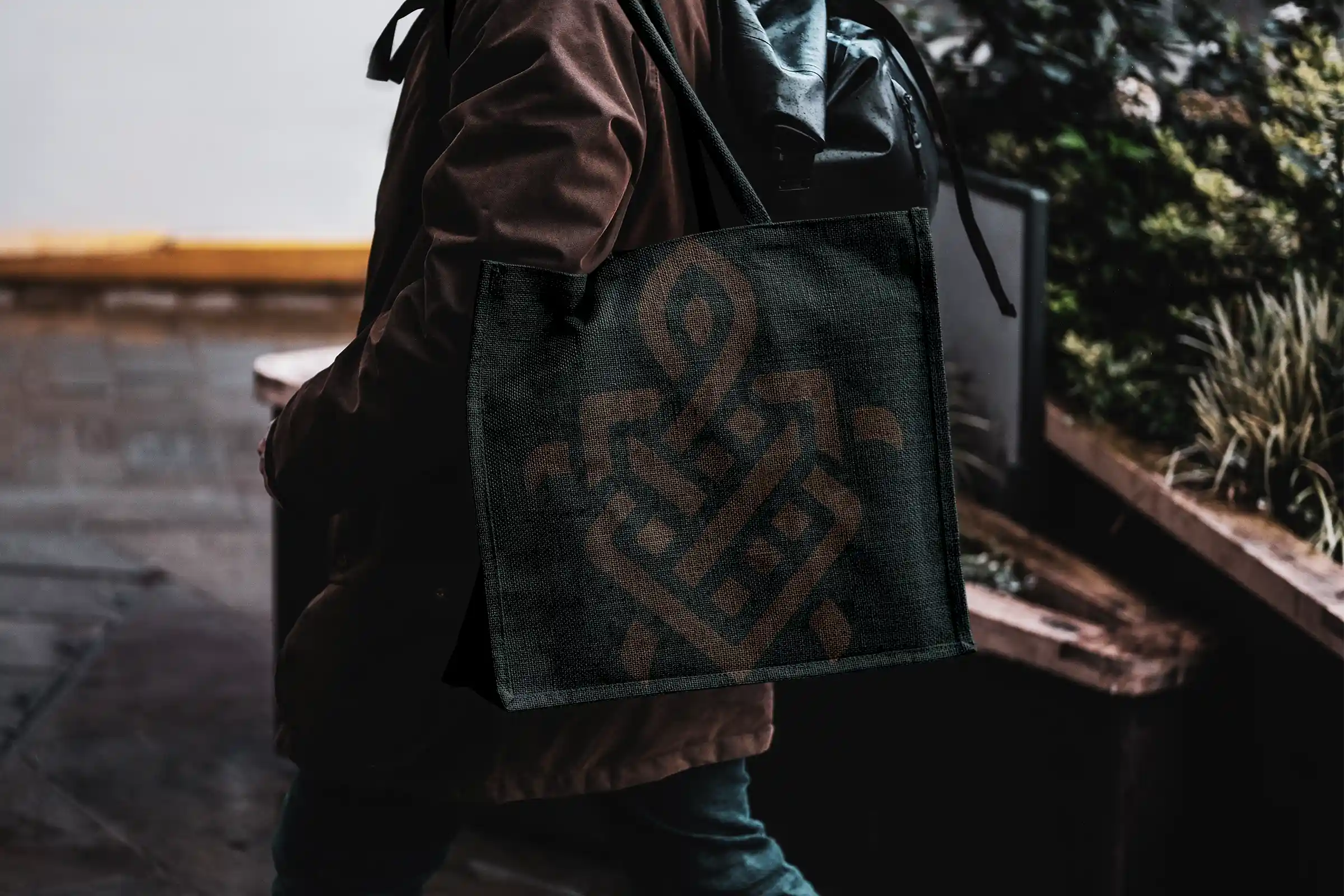
The founder of Testudo offered us two sources of inspiration for the logo mark. One visual he really loved was the endless loops of Celtic knots. These infinite woven patterns, which seem to have no beginning or end, symbolize a spiritual journey and interconnectedness. The second visual came from the brand name ‘Testudo’, which literally means "tortoise" or "tortoise shell," in Latin, and refers to the Roman military formation where soldiers overlapped their shields overhead for protection. Using imagery of turtles and Celtic knots, we came up with the sketches below:
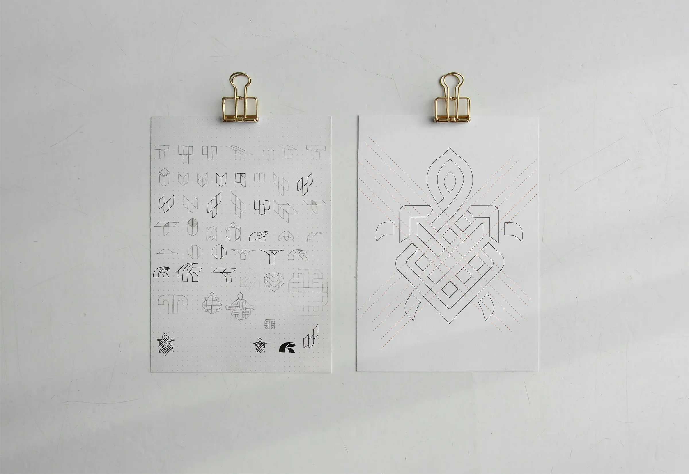
The chosen logo mark was then refined and gridded (right).
Typography
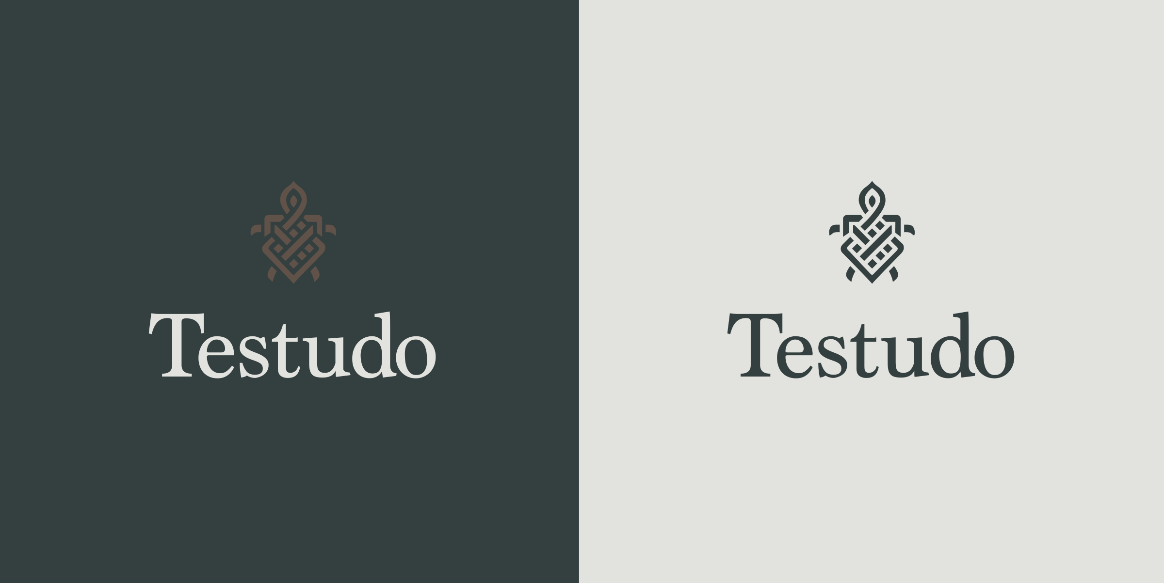
The logotype we chose is Marion, crafted by Canadian designer Ray Larabie and released by Typodermic in 2006, Marion draws from 18th-19th century neoclassical roots like early Bookman cuts, it also shows hints of Baskerville's elegance and legibility with cool flourishes like the hammer-claw serifs and blunt letter curls. We felt it matched the classic Celtic mountain motif nicely, while still feeling modern and relevant.
Testudo Color Scheme
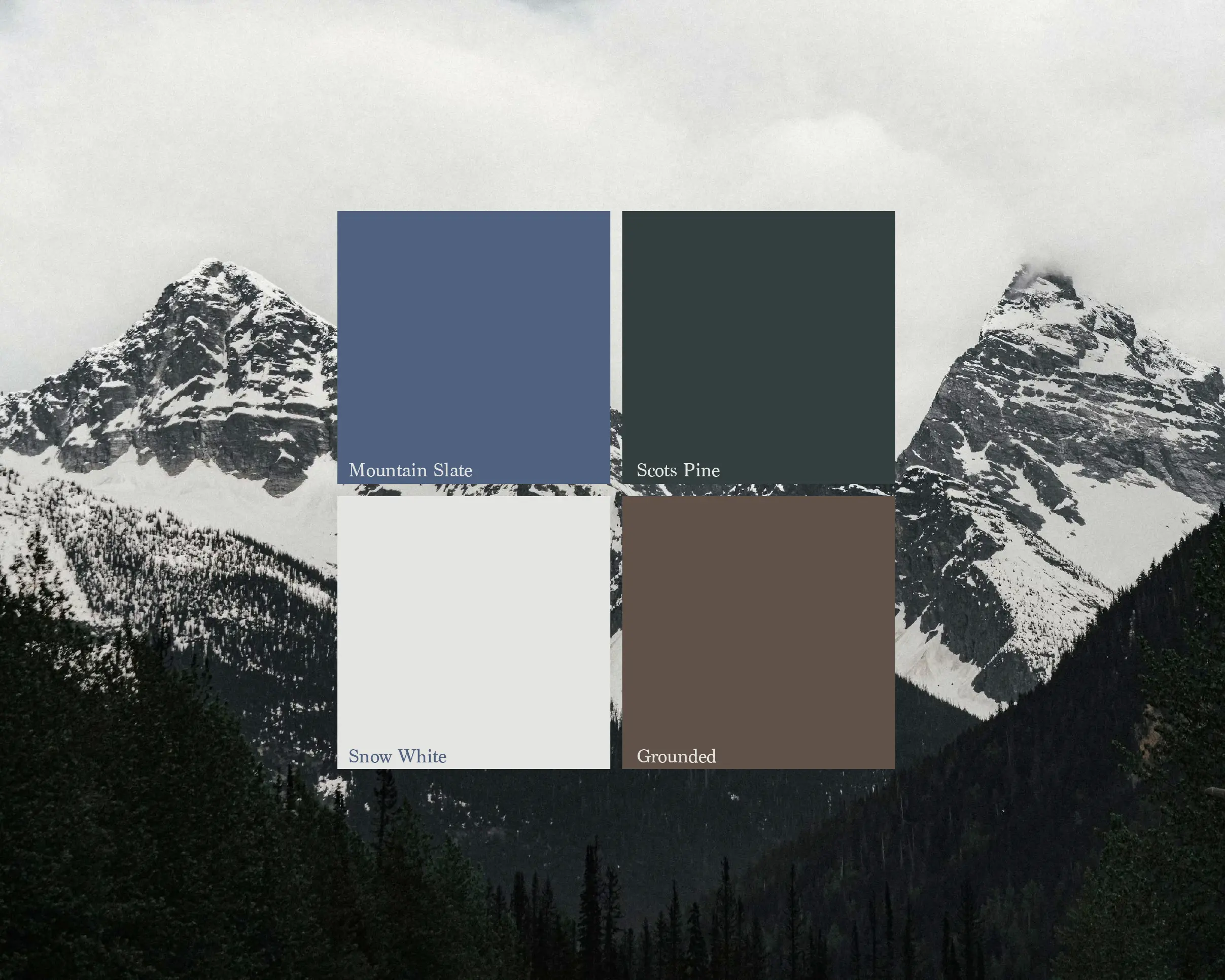
Inspired by photos of mountains, the Testudo color scheme features snowy whites, pine-inspired greens, a cold slate blue, and an earthy brown that warms up the palette and makes it feel more grounded. We named the green after Ireland's only native pine tree the 'Scots Pine', also known as 'Gius' in Gaelic. This species was one of the first trees to colonize Ireland after the last Ice Age, around 12,000 years ago!
We created the color scheme in September of 2025, and coincidentally our 'snow white' is eerily similar to the 2026 Pantone color of the year (cloud dancer), which was announced shortly afterwards.
The Results
Condensed stayed steady and constructive the whole way. The end product is genuinely beautiful and exactly the level of “polished” I was hoping for. If you want someone who can deliver a great-looking brand and keep you grounded through the messy, iterative process of figuring out your message and vibe, I recommend Condensed!
- Kyle Davis - Founder Testudo Advisory


