

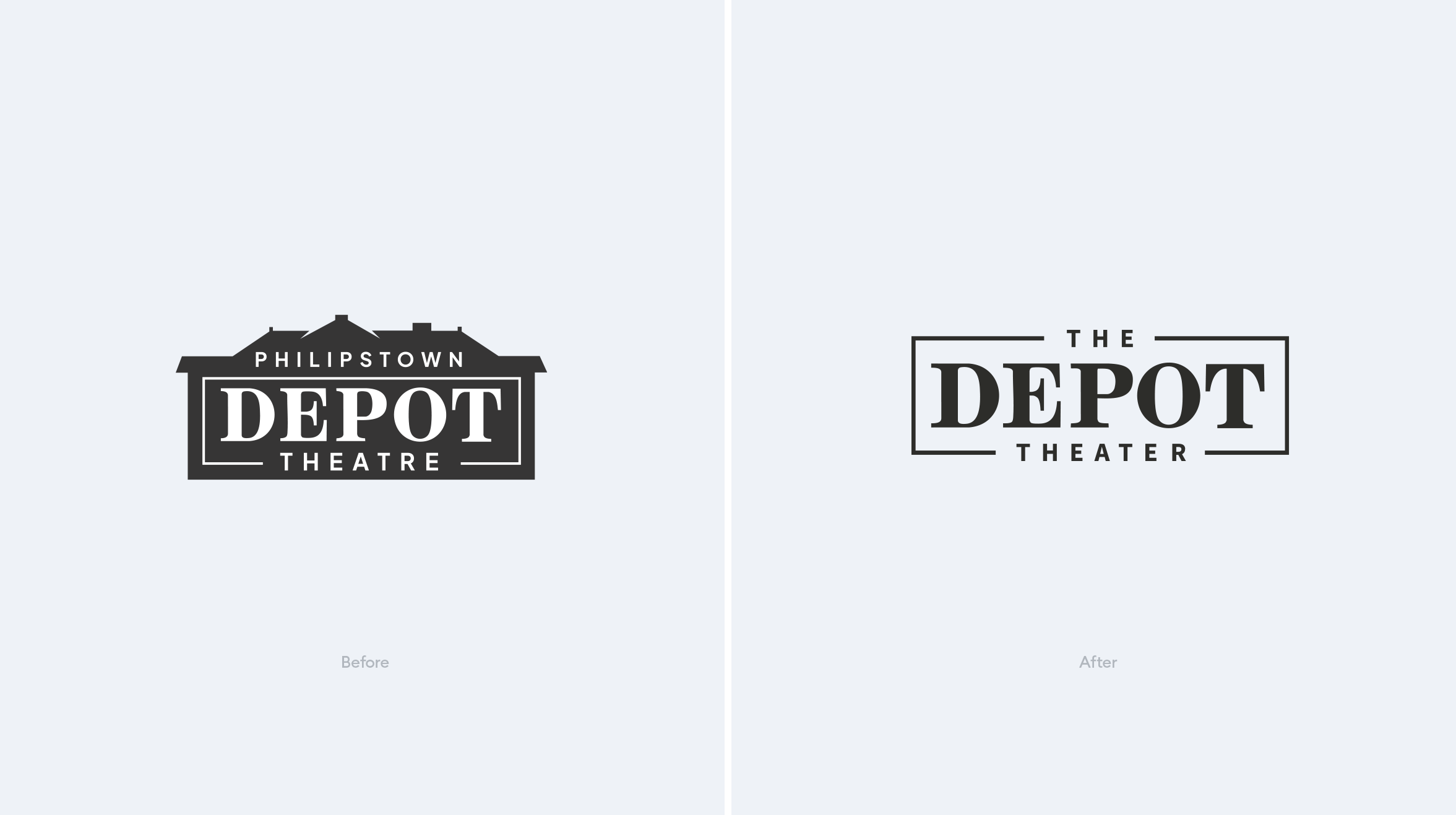
The old logo was a bit over-complicated, using using architectural details from the Depot to define the top edge of the logo mark. All this extra detail made it hard to distinguish when the logo was small. Besides simplifying the shape, we also simplified the name itself, removing the location (Philipstown). This broadens their reach to all of the Hudson Valley which they already serve.

We also helped the 'theatre' become a 'theater', they were using the old english spelling which was causing a lot of confusion. We were able to simplify their URL from thephilipstowndepottheatre.org to depottheater.org which was a huge win. The new website gives the theater a new architecture for navigation and simple clean web design.
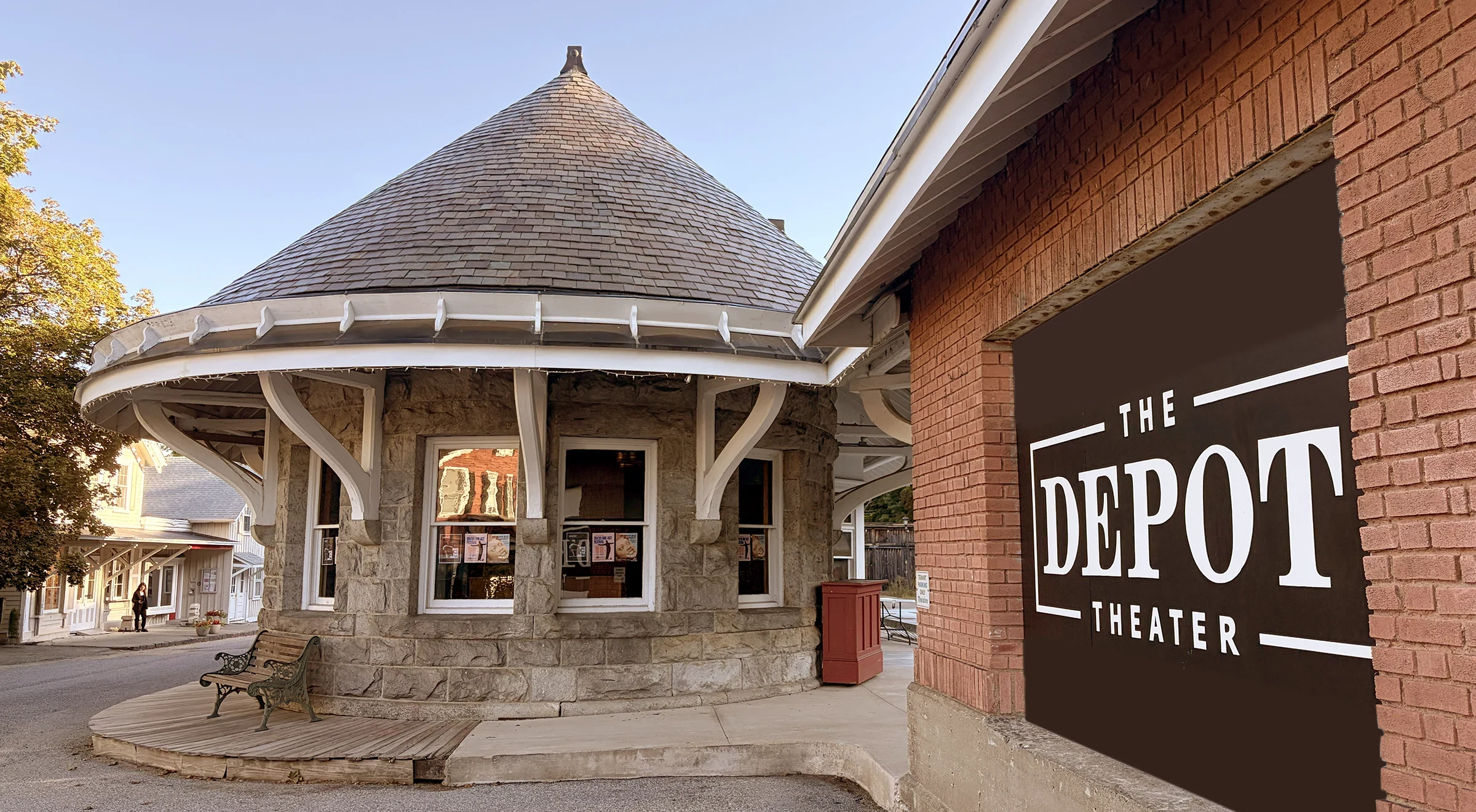
The Results
"They completely reorganized the way the theater presents itself to the world ... It was a resounding success, with board members, performers, funders, staff, and ticket-buyers all cheering the result. Condensed helped us identify and articulate what makes the Depot Theater special, what sets it apart from other performing arts venues, something we hadn't done in far too long."
– Ned Rauch, Marketing Director – The Depot Theater, Garrison, NY

Brent Lagerman
Category
BrandingTags

