Founded in 2006, Topfield is a fully ADA-accessible equestrian facility dedicated to providing adaptive and therapeutic horsepersonship for individuals of all abilities. Nestled in the Hudson Valley atop a beautiful meadow peak, the center fosters connection, well-being, and personal growth through innovative equine-assisted programs in a top-tier facility.
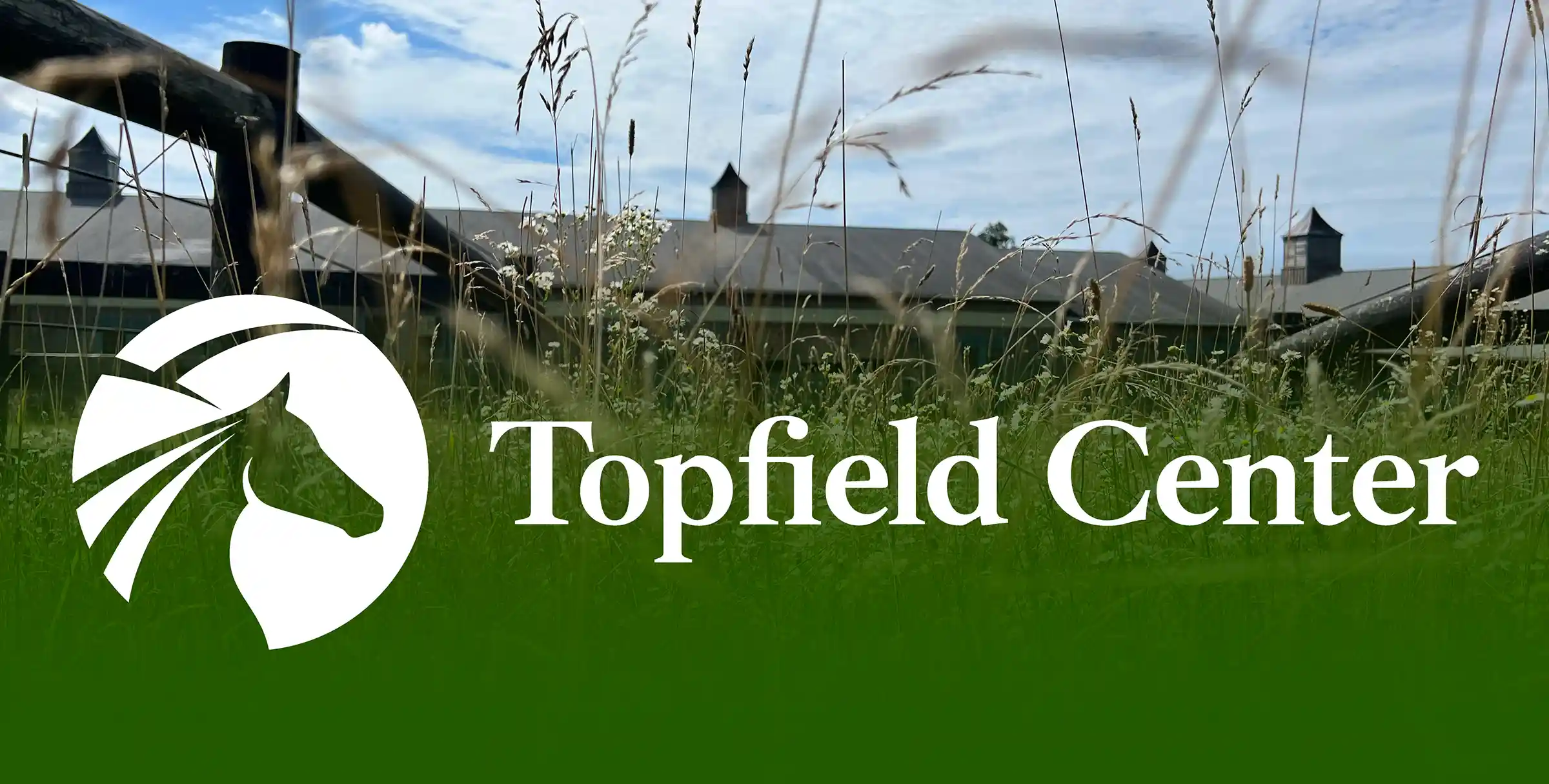
The Topfield re-brand was an iterative improvement, we wanted to retain what was great about their identity by taking inspiration from the existing illustration. Evolving a brand in this way works well with established organizations that want to hold onto their history and aren't looking for a dramatic change.
We updated their logo to make it more iconic and easier to identify at a glance, especially from far away since they use the icon a lot in their signage on the property. We updated their color application, simplifying the color scheme, and also redid the typography, making it more modern, but keeping it feeling classic.
Beyond improving aesthetics, we re-designed their website to address practical challenges they were facing. We improved navigation by architecting a better structure for their website content, we also improved the systems they had in place for content and event management.

The Results
"This was a dream project that was made achievable in every sense by the Condensed team."
Sarah Uzelac– Executive Director - Topfield


